Taylor Diagrams
The following is by Dennis Shea (NCAR)
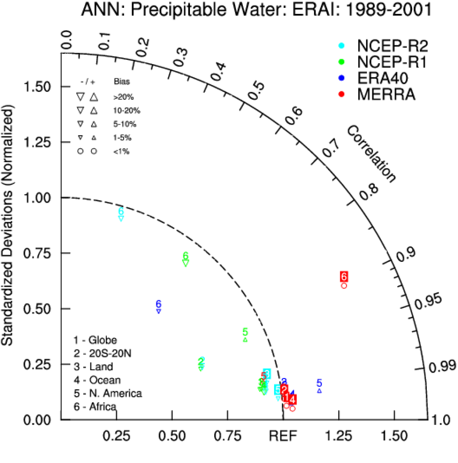
Taylor diagrams provide "a concise statistical summary of how well patterns match each other in terms of their correlation, their root-mean-square difference and the ratio of their variances." Additional information such as percent bias can be added to the conventional Taylor diagram (see below). The Taylor diagram provides a graphical framework that allows a suite of variables from a variety of (say) one or more models or reanalyses to be compared to reference data. The reference data can be observationally based (eg, reanalysis) or to another model or a control run. All variables must be on the same grid so regridding may be necessary. The official reference is Taylor, K. E. (2001), Summarizing multiple aspects of model performance in a single diagram, J. Geophys. Res., 106(D7), 7183–7192, http://dx.doi.org/10.1029/2000JD900719. Karl Taylor provides an excellent simple description of the diagram and how to interpret the plotted points at http://www-pcmdi.llnl.gov/about/staff/Taylor/CV/Taylor_diagram_primer.htm. The primer contains a link to a large suite of Taylor diagram examples.
Key Figures:
Cite this page
National Center for Atmospheric Research Staff (Eds). Last modified 23 Jul 2013. "The Climate Data Guide: Taylor Diagrams." Retrieved from https://climatedataguide.ucar.edu/climate-data-tools-and-analysis/taylor-diagrams.
Acknowledgement of any material taken from this page is appreciated. On behalf of experts who have contributed data, advice, and/or figures, please cite their work as well.